Out of the Silent Planet: Book cover survey

In preparation of our Culturezoo Summer Series where we read through Out of the Silent Planet by C.S. Lewis, I thought I’d put together a quick survey of all the different book covers I could find for this novel. There’s some interesting ones. I’ve broken them out into the following categories:

Did they actually read the book?

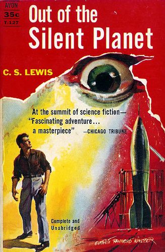
ef9e1abef044c74fc9e70772578c843d--sci-fi-books-cover-art.jpg
Good job! You correctly identified that there IS a man in this book. The rocket and the giant eyeball are, sadly, not to be found in the text.
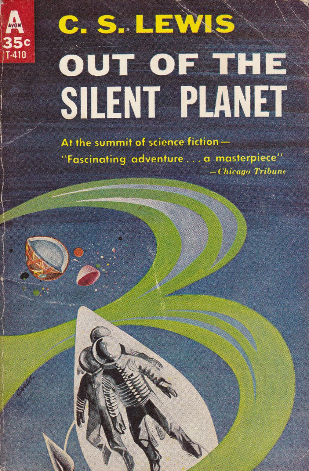
image.png
Space suits? Easter egg halves? Me and the cover artist are both really confused.
4775388238_ba37ccf982_o.jpg
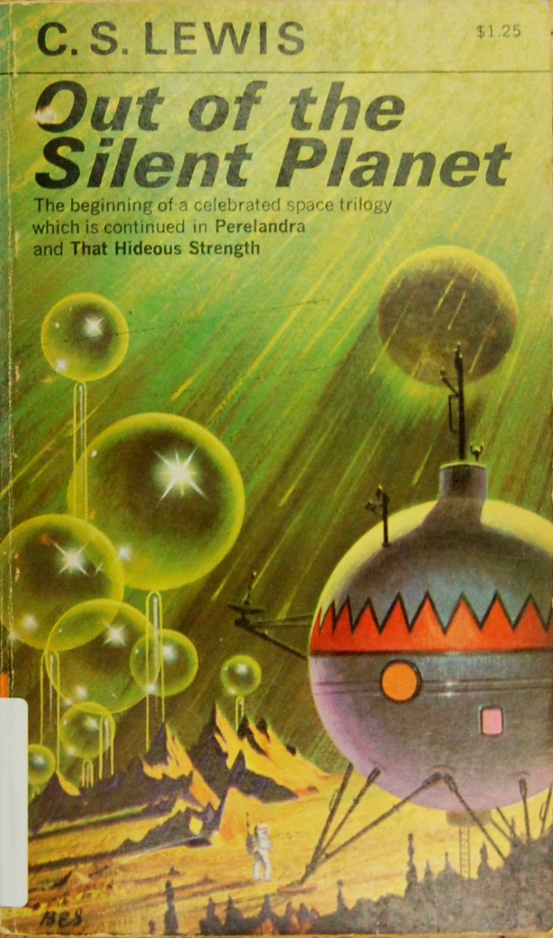
This is the copy I had as a kid. It’s interesting because it seems like the artist had a vague familiarity with the book. Enough to get the shape of the spacecraft right and there’s a slight nod towards the Malacandran structures in the background. Unfortunately this novel does not take place on the moon and nobody ever wears a spacesuit. The spacesuit seems to be a real sticking point for a lot of these covers. Also, check out the sweet Krazy Kat pattern on the side of the ship. Weston and Devine got style.


Thank you for your participation

image.png
This one feels somehow TOO faithful to the text. It manages to cram the entire plot into a single picture. Everyone except Ransom looks completely annoyed.
image.png
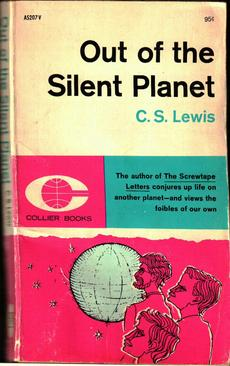
Cover artist: “So tell me about this book.” Publisher: “It’s a fantastic adventure that takes place on another planet where we meet a complex culture comprised of multiple species where religion, evolution, and myth all blend into one.” Cover artist: “I drew three guys and a globe with stars around it.” Publisher: “Nailed it.”
Image result for out of the silent planet cs lewis
This really belongs under the “We need a cover now! Any cover!” category.

Almost, not quite

7948991366_4946d80b1d_o.png
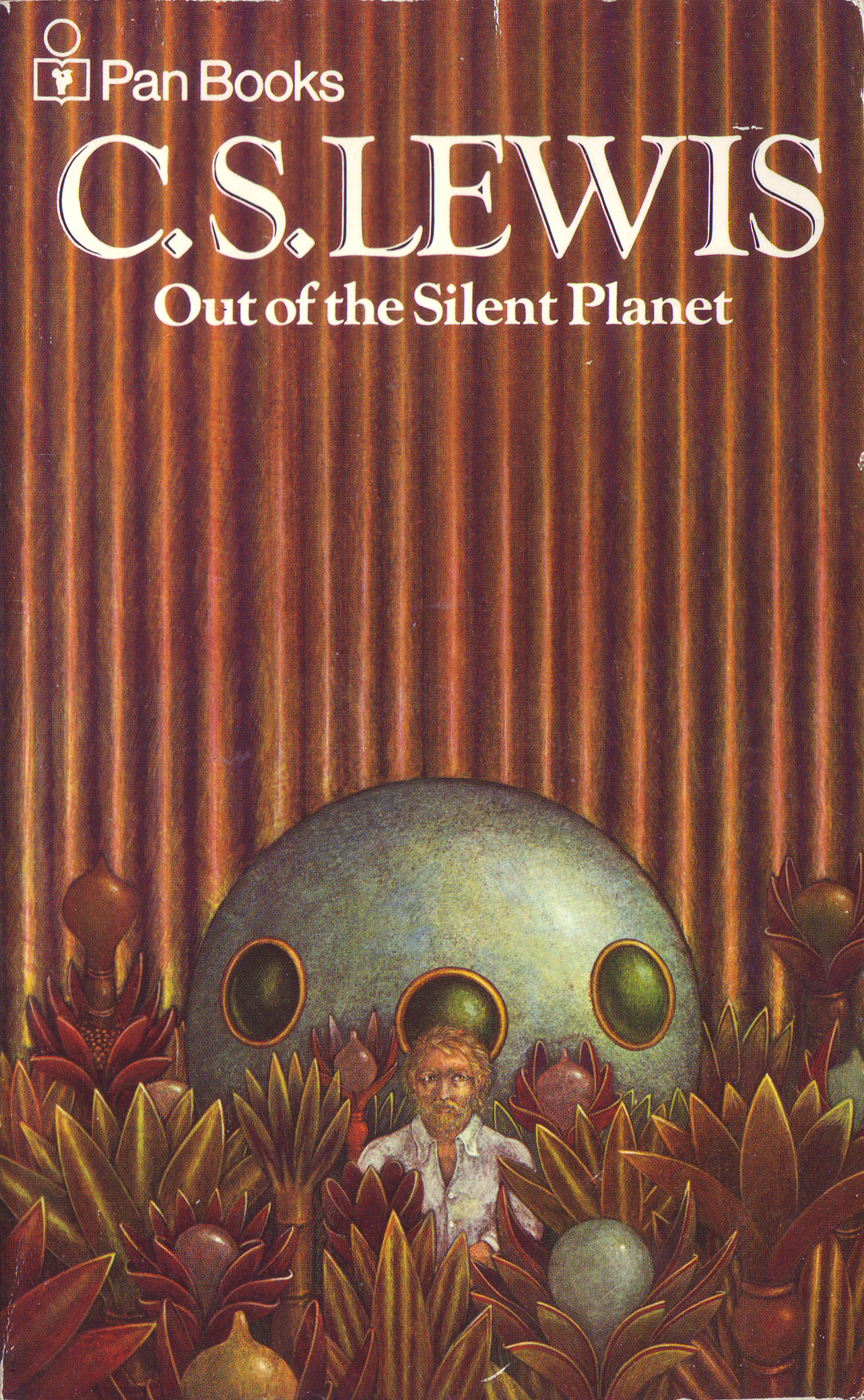
One of the key elements of the Malacandran landscape is bright, warm colors. So why does this cover scene take place inside a 1970s living room with an overabundance of dry houseplants? Ransom looks pretty non-plussed about it too.
image.png
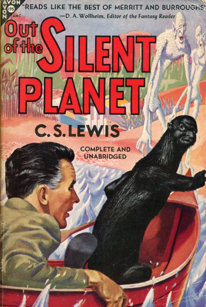
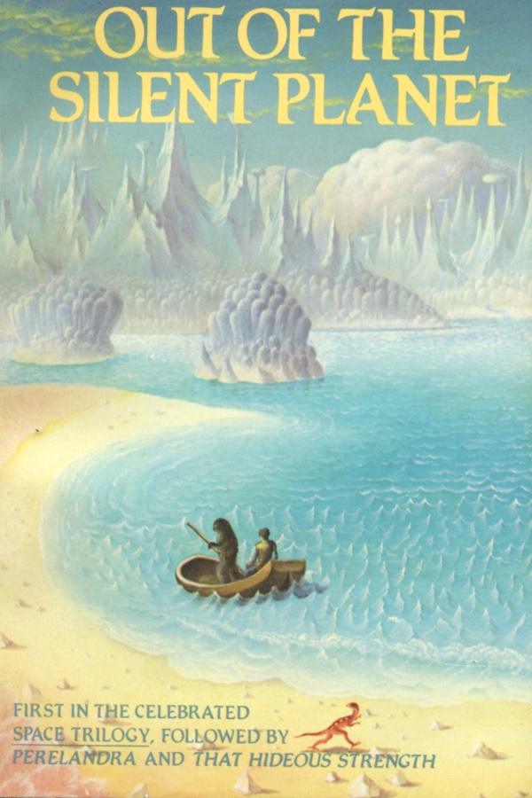
This is the cover of that most of us are probably familiar with. It’s ok. They get the main details right. I don’t know why they put a Compsognathus at the bottom. The figures of Ransom and Hyoi seem a little awkwardly rendered and the perspective on the water feels off.

Winners

Image result for out of the silent planet cs lewis
The original cover perfectly hints at the fantastic Malacandran landscape. The titles are contained in two separated spheres, like the separation between Earth and Mars. The lettering is gorgeous. The color palate is subtle but fits the story. Love this cover.
Image result for out of the silent planet cs lewis
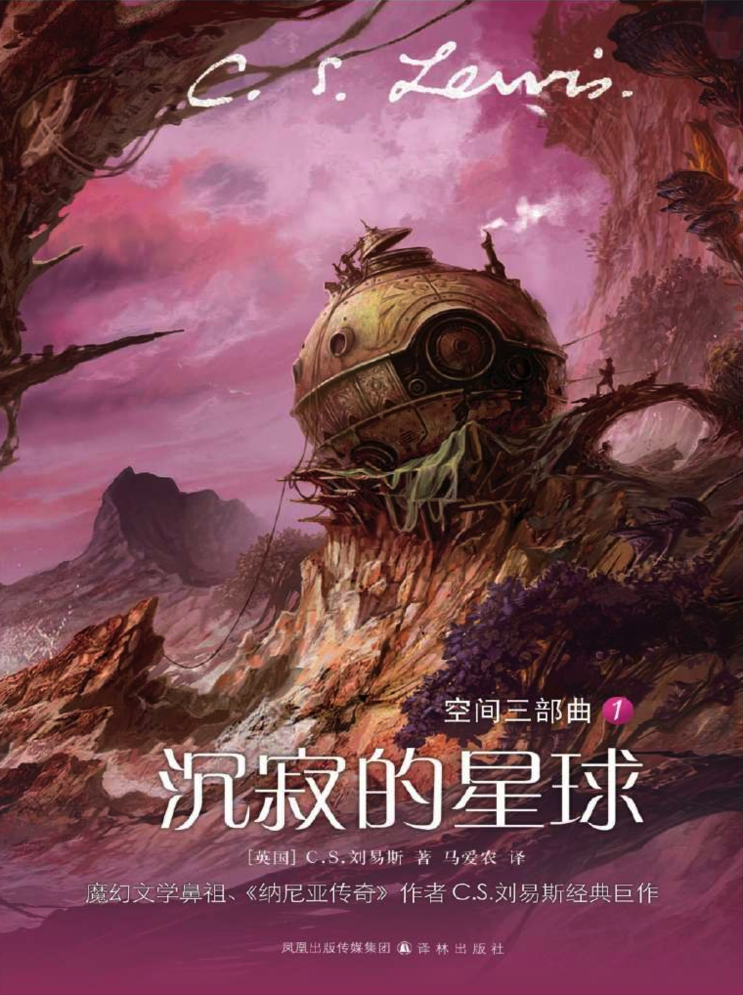
If you’re going for simple, this is a good way to do it. Some nice hints of Malacandran shapes but the real strength of this cover is a strong, graphic rendering.
Screen Shot on 2018-04-06 at 15:30:31.png
As far as more realistic renderings go, I think the Japanese edition is the best. The spaceship and color palette are especially on-point.
image.png
I love this cover but I can’t find a larger image of it anywhere. It’s an excellent modern take on the book. If anyone has a larger scan, please send it to me.


There they are, the good, bad, and ugly of Out of the Silent Planet covers. If I missed any, please send them my way.

Update: Reddit user, Jay-Em pointed out that I missed this one:

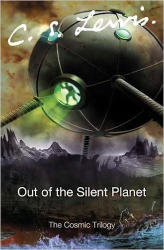
I’d say this falls under the “Beginner’s Guide to Photoshop” category. And who calls it the “Cosmic Trilogy”?

A different look at Tolkien

I love Peter Jackson’s Lord of the Rings. Of course I do. They’re wonderful. (The Hobbit, not so much.) That aside, it is a shame how much his films have hijacked the imagination as to what Middle-Earth looks like. Just try to picture Frodo without imagining Elijah Wood. Next to impossible, right? It’s a shame because Tolkien’s universe is a place that should be so stimulating to the visual imagination.

As an antidote to the “Jacksonation” of our Tolkien imagination, I present Tove Jansson’s delightful Hobbit illustrations.


Gollum in his boat.


The petrified trolls.


In mirkwood

View all of these illustrations here.

Thanks to Les McClaine for sharing these!

Favorite Artists: Paul Pope

pope1

If you haven’t explored the work of Paul Pope I can’t really blame you. He’s pretty obscure even by way of comic artists. Most of his work is criminally out of print.

I first heard about Pope back in the 90s when some friends of mine reviewed his indie comic THB in their ‘zine (‘zines were like blogs before the internet). I managed to snag issue #1 of THB in my local comic shop. THB #1 was pretty different from a typical DC/Marvel publication. It was black and white and thick, more the weight of a catalogue than a typical comic. The art itself was very loose, changing styles as the story progressed: from heavy ink, to B&W washes, then almost appearing to be the pencil roughs for long periods.

pope2

The story of THB was at once typical sci-fi fare (a girl growing up on Mars) and at the same time something very unique thanks to Pope’s world-building skills. However the thing that really had me hooked was the art. In my humble opinion Pope understands how ink should be used. All of his drawings have a fluidity and energy that are enhanced by the drama of being black and white. He’s someone I try to ape when I ink.

Just look at the energy and excitement in these two panels where the heroine of THB destroys an evil piano.

pope3

Pope recently stirred the pot a bit when he remarked that DC Comics only made comics for 45-year-olds and he wanted to make comics for kids. I wish more skilled artists approached comics with the same zany attitude that Pope does.

pope4

The only work of Pope’s that is currently in print is his new series Battling Boy. It’s really great stuff: lots of fun with outstanding art. I only wish it had been published in black and white. Pope’s work always seems to look sharper without color. Personally, I’m still hoping for a reprint of all the THB comics in black and white. I have no idea why it hasn’t happened yet.
Will Terrell

If you’re just starting out or even if you’ve been drawing for a while, I highly recommend watching Will Terrell’s videos. He seems like the nicest guy. Will, if you read this, can we hang out sometime?

Do not miss the videos where he shows his progression from mediocre to excellent over the course of ten years: