Don’t know why but here’s a second in the series. I drew this one with a really fine pen. It had an interesting result. I prefer brush and ink but I felt like breaking it up a bit.


Don’t know why but here’s a second in the series. I drew this one with a really fine pen. It had an interesting result. I prefer brush and ink but I felt like breaking it up a bit.
 I made this dragon for a joke. He is roasting a hamburger. This was one of the last drawings I did before breaking my hand. My hand is better now, so I can start doing ODAD drawings again!
This was my attempt at drawing someone looking up. It’s harder than you would think.

Not sure what’s going on in this picture. I mostly drew it to work on proportions.

After almost two weeks, I’m back. Where was I? A little place called, Very Sick.
So to get back in the groove, I decided to draw Batman. Batman, while not my favorite superhero, is certainly the most fun to draw. He really works well in black and white.

I like this ODAD. It’s not a great picture, but it’s a clear picture. It communicates a point. This guy is a bad guy. He’s wearing boots, a belt, and a button-down shirt. When I look at the picture, I get it. Also, something about his posture and expression seems cocky. There’s problems with it but I like that it actually says something. Or am I just imagining it?

Here’s some characters in pencil.


This one is pretty rough. Mostly it’s just trying to work on something that has unified composition. The photo isn’t very good either. It looks better on the paper.

This drawing is for Lily. She kept asking me for a picture from Terry and the Pirates (she’s a fan too). I asked her if she wanted me to draw one of the girls and she said “No, draw the big guy.” When I asked why him she said, “Because he’s always getting everyone out of trouble.” Makes sense to me. Lily is always so sensible.

I love a lot of comics but if I had to pick my favorite-drawn comic, I would choose Batman: Year One, drawn by David Mazucchelli. There’s something about the simplicity and realism that I find captivating. In the comic, Batman doesn’t look like a bodybuilder on steroids; he looks strong but human. And he looks like Gregory Peck with his mask off; cool, right?
But most of all, Mazucchelli is a master composition and visual storytelling. Take this panel for example:
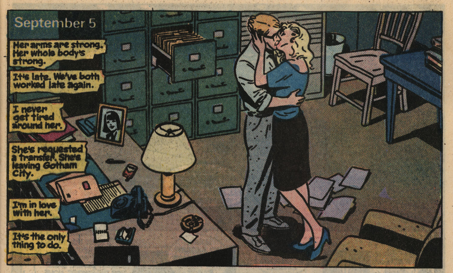
Every detail serves the story. From the open filing cabinet drawer to the file dropped on the ground, and the photo of his wife on the desk, there is no need for the captions to say anything about what is actually happening. The image tells you the whole story, and any words can address what is not in the picture. It’s night, and she’s requesting a transfer. Beautiful.
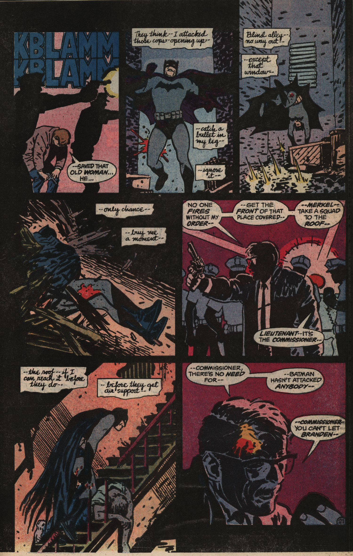
And checkout the energy on this page:
And this panel:
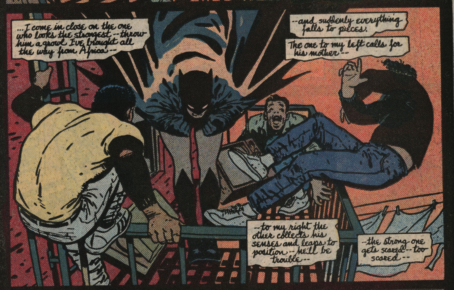
Do you get why I love this comic?
